|
|
Post by tv on Mar 6, 2017 18:29:20 GMT -8
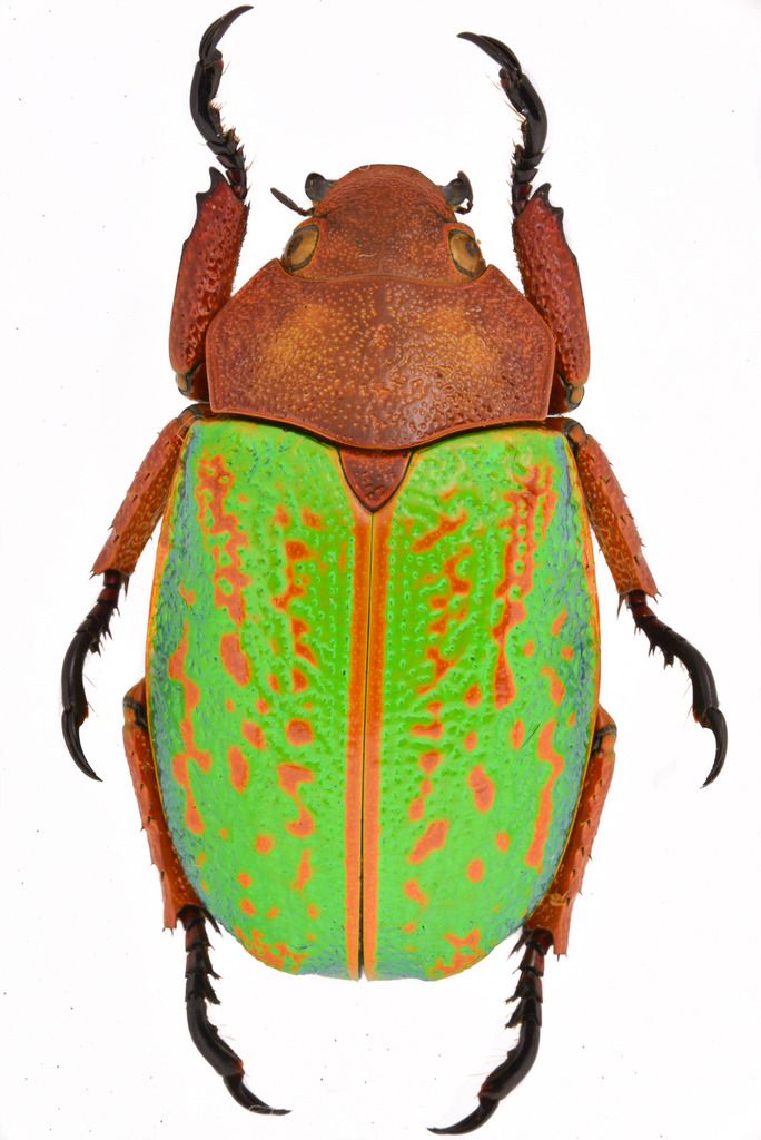
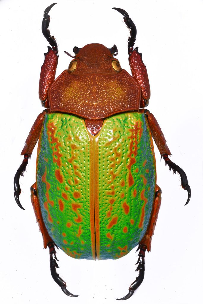
I've been playing around with different lighting options for my macro photography. The two setups I have been working with lately are a light box I made out of plexiglass with 5 or 6 flashes set up around it, and a set of 3 flashes that mount on the end of the macro lens. They have very different results that I thought might be of interest to my fellow photographers. I was testing out using a Chrysina victorina, since it has such vivid coloration. The first picture was taken using the light box, with a flash set up on both sides, 2 on top aiming down and one from the bottom front. All flashes are directed through the white plexiglass, so there is no sharp light at all to cause shadows. The image here was touched up a little in Lightroom, but really all I did was adjust the white balance, increase the exposure, and then make the background white.  The second picture was taken with a Nikon R1 macro flash with three flash units. They were mounted on the front of the lens with about 120 degrees between each of them. I placed 1 directly at the 6 o'clock position and then the other two were at roughly 10 and 2 o'clock. I processed it the same as the previous photo. As you can see, there is a very different look when you have a sharp light source that accents texture. The pits in the elytra are much more exaggerated. At the same time, you lose some of the coloration and details in the areas where light is reflecting off the surface and on the sides where the lighting wasn't as even.  I like aspects of both photos, but have been thinking about ways to light that would combine the best aspects of both. Anyone have experience with this? |
|
|
|
Deleted
Deleted Member
Posts: 0
|
Post by Deleted on Mar 6, 2017 18:36:01 GMT -8
I certainly can't offer advice on the photo tech stuff, but I wanted to simply say that pic 2 is totally awesome. Improving on that, to me, seems impossible. Just my thoughts.
|
|
|
|
Post by tv on Mar 6, 2017 18:40:32 GMT -8
Photo 2 is also by far the easiest to take since the flash is mounted directly on the lens.
I guess maybe it boils down to the purpose of the photo. If it is as a pure scientific documentation then the 1st may be better. On the other hand, the sharper light and shadows give a more real life quality to the second one.
|
|
Deleted
Deleted Member
Posts: 0
|
Post by Deleted on Mar 6, 2017 19:40:04 GMT -8
I know I'm treading in territory I'm not expert in, but even for scientific work, the second pic is superior. The extreme detail to the elytra patterning and pronotum is of paramount importance. The first pic, in my humble opinion, is more artsy...cool looking, but not detailed enough for me. The possible exception would be the superior femoral detail of pic one. Now....hopefully some people better than I will jump in. If you could get the femoral detail of pic one into pic two, you'd have it made as far as I'm concerned. The part jumping out loudest for me is the elytra detail difference.....nod goes to pic one. Ok, enough from this old goon.......just had to say what I think.
|
|
|
|
Post by tv on Mar 6, 2017 21:04:55 GMT -8
No I appreciate it. Like I said I definitely think the second pic speaks to me more as well.
|
|
Deleted
Deleted Member
Posts: 0
|
Post by Deleted on Mar 6, 2017 22:45:59 GMT -8
I know I'm treading in territory I'm not expert in, but even for scientific work, the second pic is superior. The extreme detail to the elytra patterning and pronotum is of paramount importance. The first pic, in my humble opinion, is more artsy...cool looking, but not detailed enough for me. The possible exception would be the superior femoral detail of pic one. Now....hopefully some people better than I will jump in. If you could get the femoral detail of pic one into pic two, you'd have it made as far as I'm concerned. The part jumping out loudest for me is the elytra detail difference.....nod goes to pic one . Ok, enough from this old goon.......just had to say what I think. "......nod goes to pic one." Oops......obviously I meant to say pic two, not pic one. |
|
|
|
|
|
Post by nomihoudai on Mar 6, 2017 23:53:48 GMT -8
I like pic one better, as the colors are more even. But yes, I get why beetle guys like the second with its 3D structure.
Have you tried putting pieces of black cardboard next to the beetle within your first setup? It will give a small, well planned shadow to the pic and thus enhance three dimensional features.
I cut small and narrow strips of black cardboard that I glued to a needle and placed them directly next to the butterfly wing between flash and butterfly to enable me to photograph withish butterflies on white background.
|
|
|
|
Post by africaone on Mar 7, 2017 0:18:43 GMT -8
for identification and reliability the second is much better than the first.
I have excatly the same problem to solve, fortunetely for me with uncolored beetles (Nigidius) but with the 3D problem more accentuated (because of MD an canthus).
An expert suggested me to make articial shadow to enhance the 3D détails (such you try on second picture). that is the same kind of of problem when you take picture in the wild early morning to enhance color and 3D or at midday that flattens completely the image with the problem that in our case the color is very important. I have made some tries (unsatisfactory) and will make a new session of tries to find the best solution.
|
|
Deleted
Deleted Member
Posts: 0
|
Post by Deleted on Mar 7, 2017 6:39:22 GMT -8
Definitely macro flash. The color tones are washed out in the first photo. Light is never even on 3D objects. Small reflections are natural.
|
|
|
|
Post by exoticimports on Mar 7, 2017 19:30:46 GMT -8
Most serious photographers use ring lights. They're inexpensive and provide full, consistent lighting. No flash too.
Chuck
|
|
|
|
Post by maurizio on Mar 15, 2017 21:39:51 GMT -8
I'd try to put the three flash units respectively at 1, 3 and 5 o'clock position, and a white vertical paper on the opposite side of the specimen to reflect the light. In this way you might create an asimmetrical shadow which would enhance the quality of the picture.
|
|
|
|
Post by tv on Mar 17, 2017 4:11:39 GMT -8
That's an interesting idea. I'll have to give that a try. I also have a ring light that I'll try out and put photos up to compare.
|
|
|
|
Post by tv on Jun 7, 2017 18:50:02 GMT -8
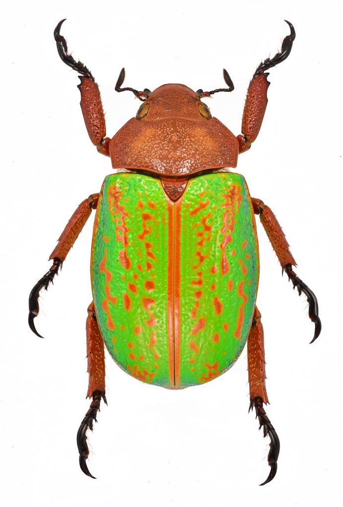
Tried to get something in between. I realized I had been leaving the diffusers down on the flashes, so it was getting diffused twice. Took them off and used the light box again and this time you get a sharper light while still getting a more uniform lighting. (It also helps that I spread the specimen to give a little better presentation)  |
|
